
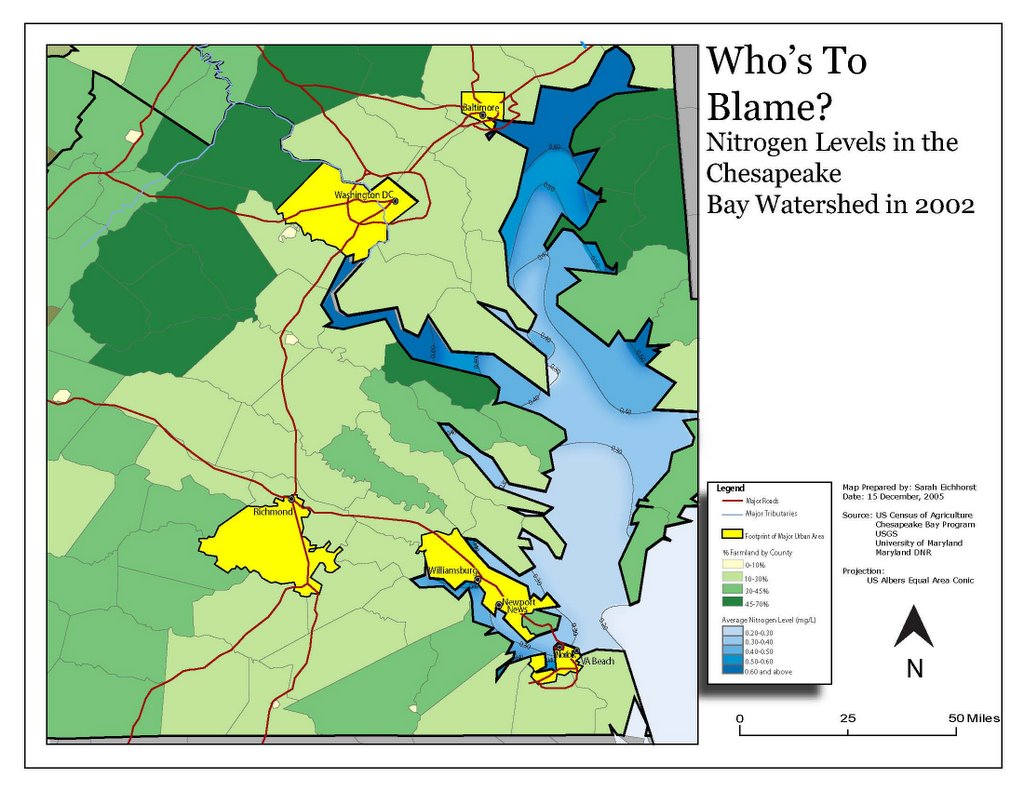
Updated Map.....ALMOST DONE!!!!
And I got to stand on my desk chair and yell "I'm a golden god" cause I got the filters right in illustrator so everything isn't glowy white and looks like I intended it to look. Just have to add some text now talking about the urban vs rural problem and bay stuff. And make line breaks for the isolines. Gonna print it tomorrow and show it to TA to see what he thinks (though last time I did that I pretty much had to redo the whole thing.........but I don't think he could make me do that now, could he??)
Alright, what do you think now that you maybe know what this is showing? Do you think the whitespace needs to be a color other than white?? There will be another text box in that big blank space in the middle. Is white ok or should I make it another color?
Thanks SOOOOOOO MUCH for helping, everyone!! I'll get you nice things!!!!!!!!!!! I have the best friends EVER.....seriously.
posted by Ubiquitous Leader SK @ 10:46 PM
![]()
![]()
5 Comments:
looks awesome!!
Yay! Thanks Jo!!!
I think it looks really good.
A+ + + + + + + + + + + + + + + + + + + + + + + + + + + + + + + + + + +!!!
Yay! Sarah likes it too. And she knows what's going on!!!
I think it looks badass! Although, I do think it would look better if the white space were gray or beige or some neutral color (but the key remained white).
Post a Comment
<< Home