
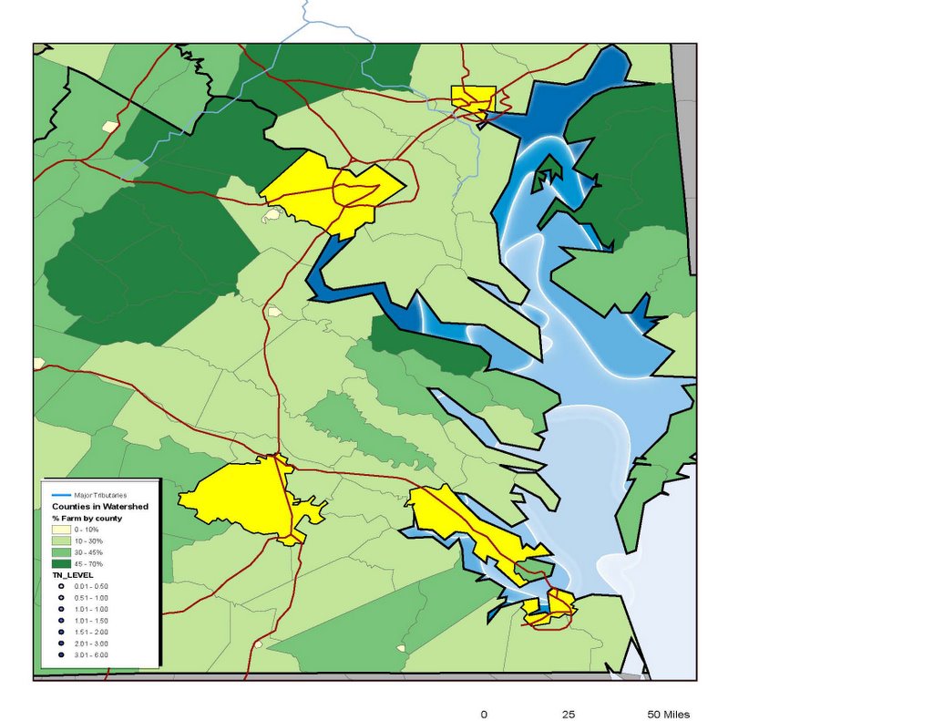
Sari's final project map....thus far
Ok, I have until Thursday at 5 to finish this, but that's really Wednesday cause on Thursday I have a stats presentation in the morning and a GIS exam in the evening that needs to be studied for. Now.....technically speaking as far as what needs to be completed, this is almost done. But I don't know if I like it. I think maybe it looks too cartoony. My TA suggested that I put the percentage farm AND the urban areas AND the Chesapeake Bay nitrogen levels all on one map. I personally think this made it look crappy. The colors in the nitrogen levels look AWESOME next to the flat grey counties, but when you add the green for the farm I HATE it. The farm map by itself looked AWESOME with the color scheme. With the blues I HATE it. Anyway, I'm gonna post it here (it's big and there's no text on it yet and the legend is wrong, ignore that) but PLEASE tell me what you like and don't like. Brutal honesty here people. I need to know. (Personally I still think it needs to be 3 maps, but I'm letting that alone. I stuck with my yellow urban areas instead of red cause GOOD GOD did it clash.) Any and ALL suggestions appreciated and taken.
Thanks,
Sari
posted by Ubiquitous Leader SK @ 10:59 PM
![]()
![]()
6 Comments:
can you email it to me? i'm confused on what is all being mapped.
it won't help
there's no title or text on it
Even if I e-mail it you will still be confused
Plust it's a bitch of a file to attach
lol uh,
it looks fine to me . . .
I guess i don't really know what I'm looking at . . .
For the confusion.....
It's a map of nitrogen in chesapeake bay. That's the blue. The darker the blue the more intense the levels. They go up by 0.1 mg/L intervals. Tell me what you think of the colors in that and if there's something I can do to make them not look so disjointed or if you like/dislike the white glow.
The green is % farm by county in the watershed. Darker=more. That's on the legend. For that I mostly need to know if the green looks ok with the blues and if not how to make it look ok and maybe how to make it look not so flat toned and have the land distinctly separated from the water.
The yellow are footprints of major urban areas.
This is all cause nitrogen pollution is a big problem in the bay and it comes from both rural and urban sources so I wanted to show how maximum levels correspond to the farming and urban uses of land.
The map will eventually (tonight) tell you all that too.
Sorry....just look at the colors and tell me if it's pretty even if it doesn't make sense.
oh, in that case;
yes, i think it looks pretty. The green and the blue is not as bad as you think. I think you're right about the grey and blues tho--that would def. be prettier. However, doing the farm percentages in shades of grey would be difficult to pull off, given that you have to also color the urban areas. Yellow urban areas definitely trumps red.
I think what might look a little better is getting rid of the white lines separating the blue areas. I can see how this would look really good w/ the grey land areas, but it doesn't quite look right with all the other colors--kinda makes it look like the white areas represent another nitrogen lvl. That may help it look less cartoony too.
Hope this helps :)
Thanks Jess,
It really does help. I'll be sure to post a final version so you can all see it once it's all perfected.
Glad the green and blue doesn't suck as much as I think it does.
Post a Comment
<< Home